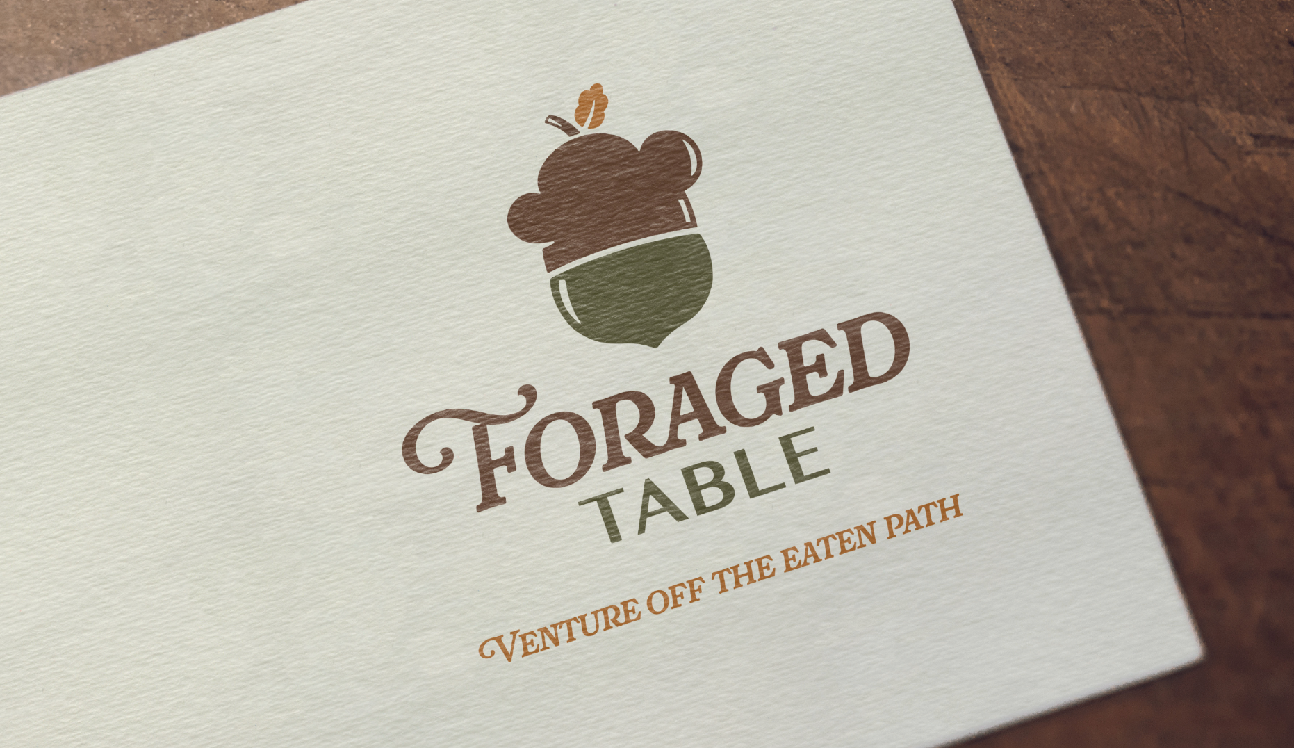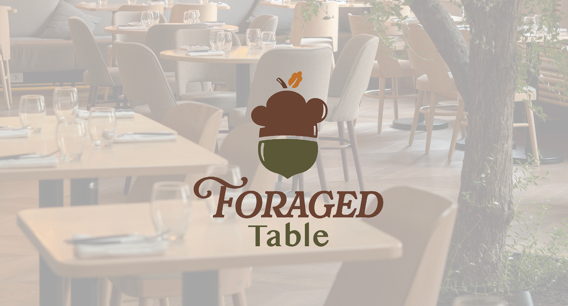
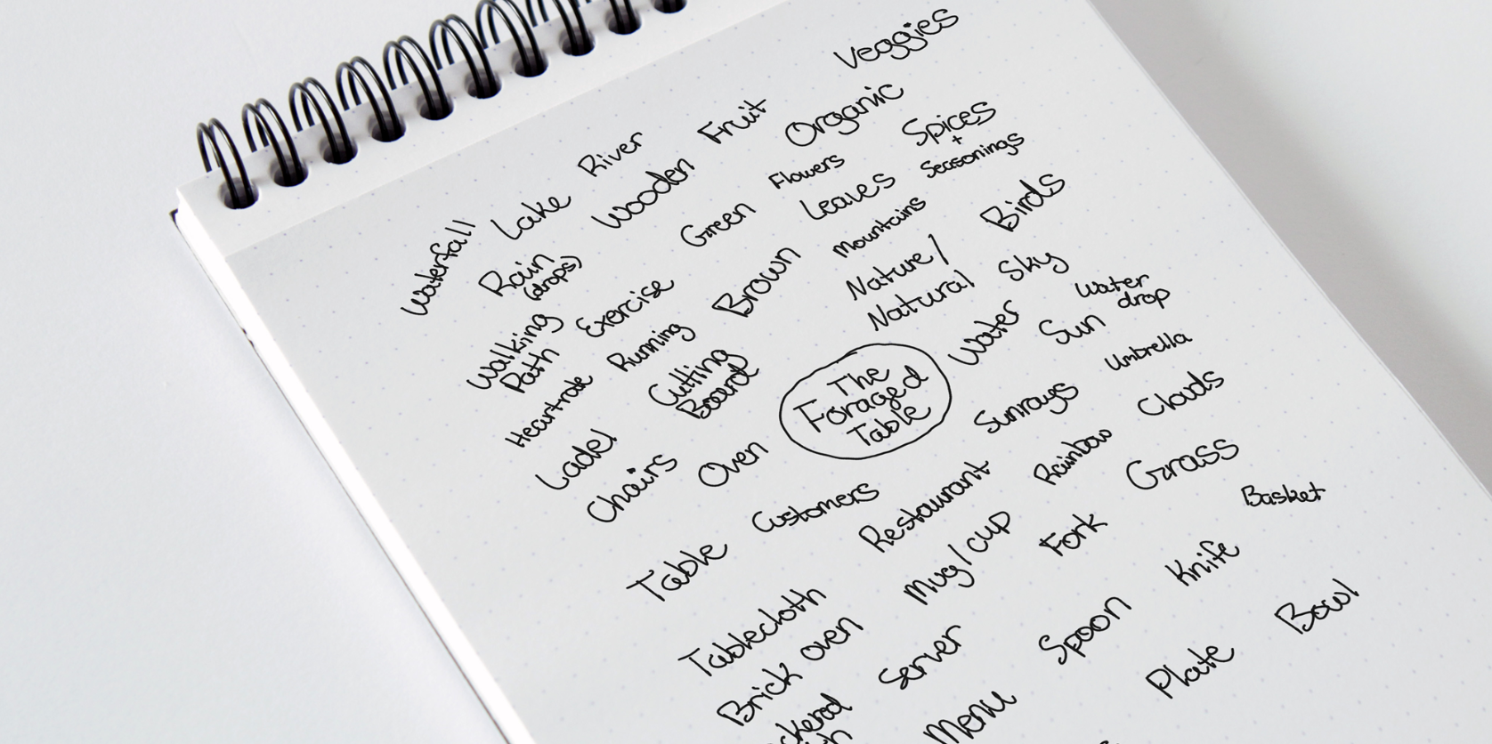
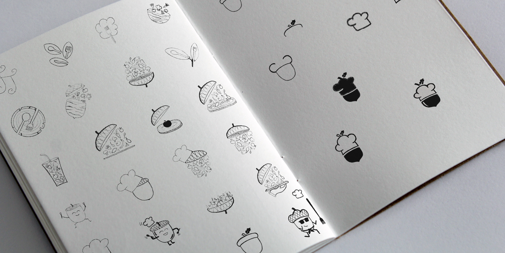
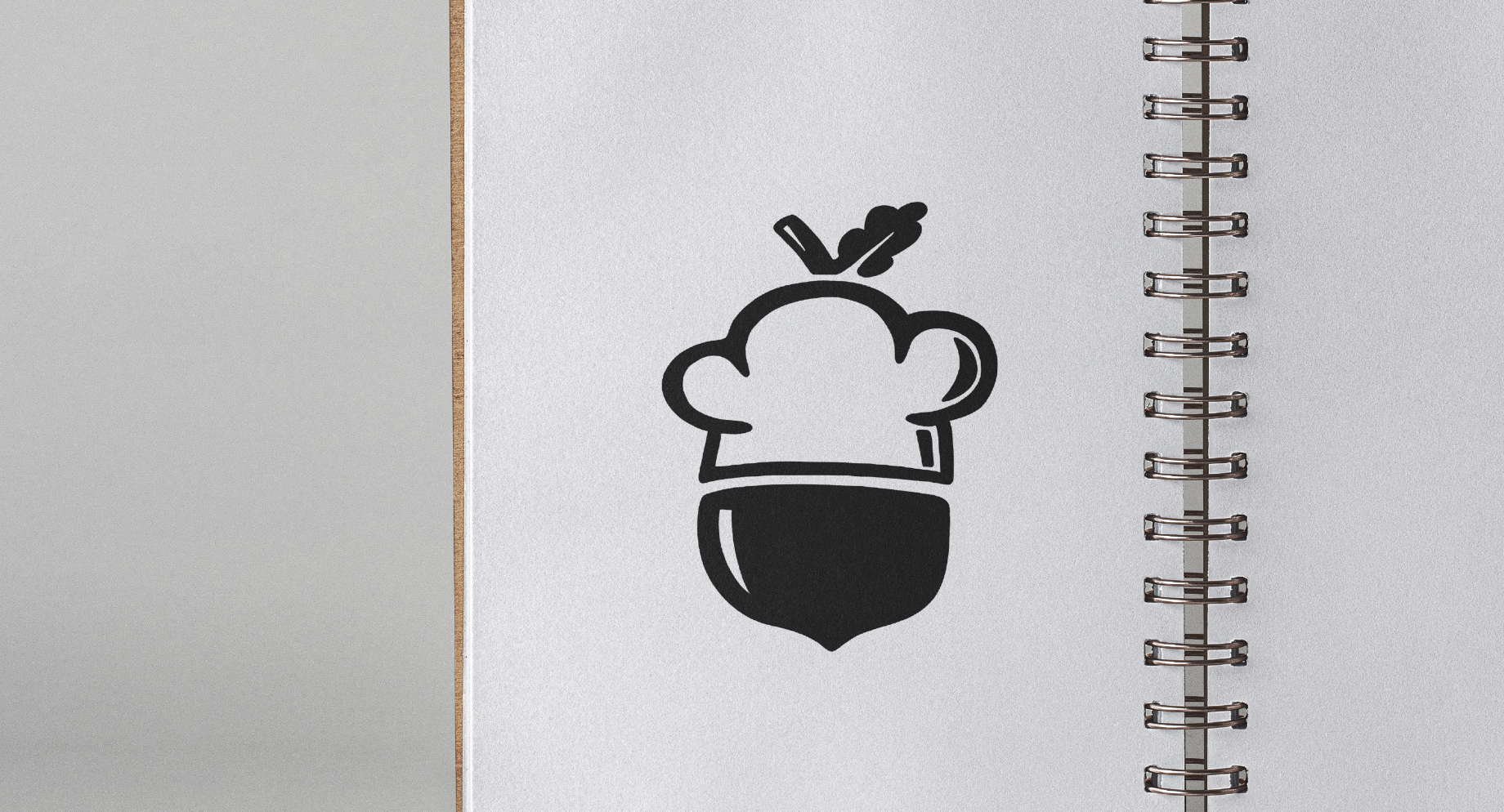
I began by creating a word web, writing down everything I could think of pertaining to nature, food, restaurants, etc.. I knew I wanted the logo to equally represent dining and nature, so I did my best to come up with an equal amount of ideas for both. Through my brainstorming and sketching process, I quickly decided that an acorn would be a fun and unique way to represent nature. It also avoided the obvious answers such as leaves or trees, which I loved! Continuing on, I found that the top of an acorn could be replaced with a chef hat, and slowly the Foraged Table logo started to take shape. I chose my strongest shapes and ideas and formed them into a clean rough of the logo, ready to be vectorized and colored!
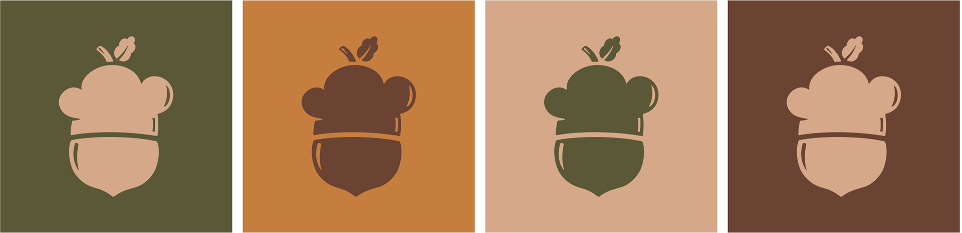
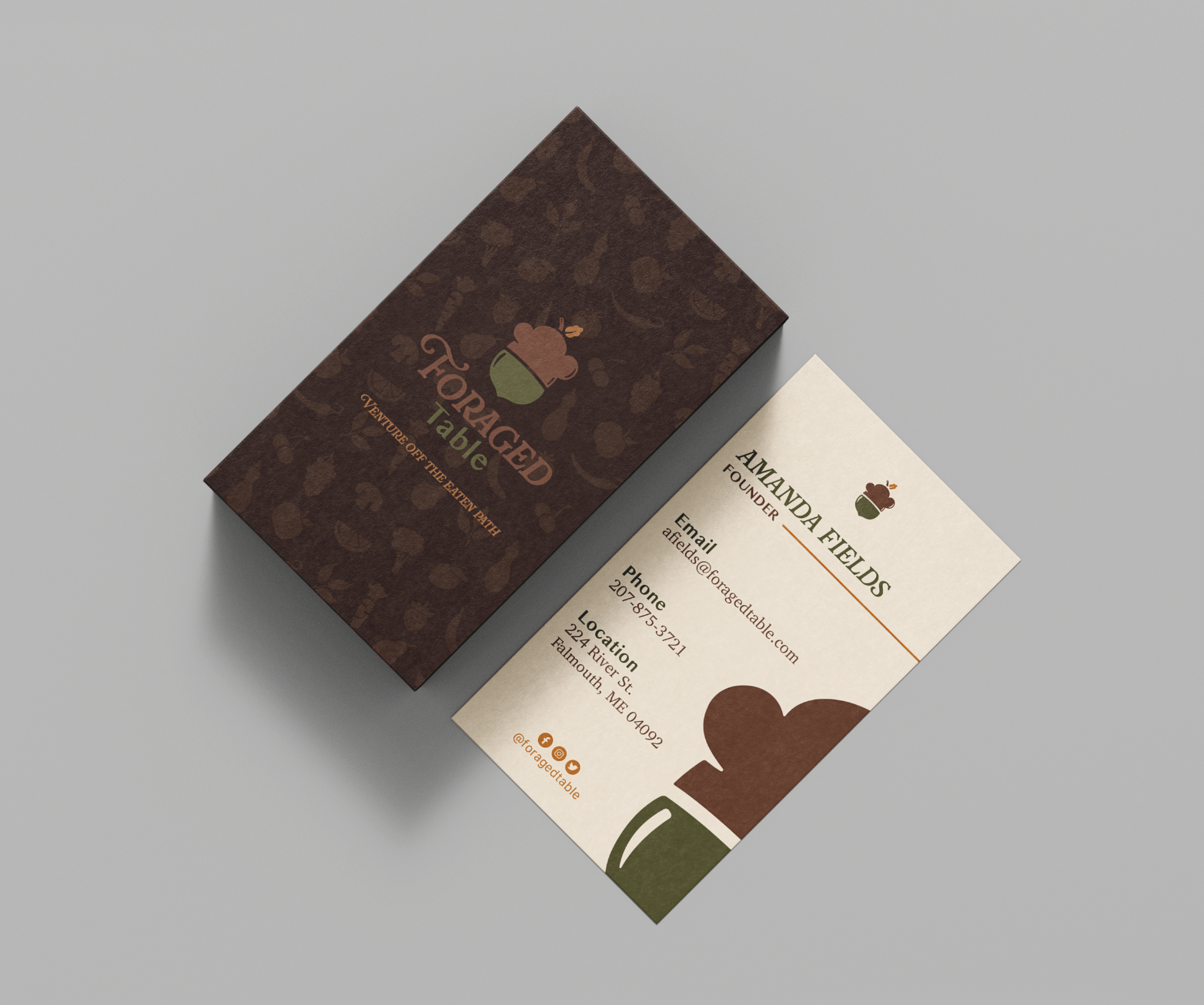
Once I had my rough solidified, I moved on to type, color, and logo variations. Since the cafe is focused on organic choices and healthy options, I opted for an earthy, neutral color palette, adding orange for a pop of color. For the logo’s type, I chose fonts that gave both a rustic and modern feel to the design, with flourishes giving the feel of growth or tree branches. I also designed a pattern to be used on business cards, vehicle wraps, menus, and more. Lastly, I created several variations for the layout and color to ensure proper versatility of the logo, before settling on what would become the final design!